Monday, 16 December 2019
Tuesday, 3 December 2019
Friday, 22 November 2019
Friday, 15 November 2019
News-representation
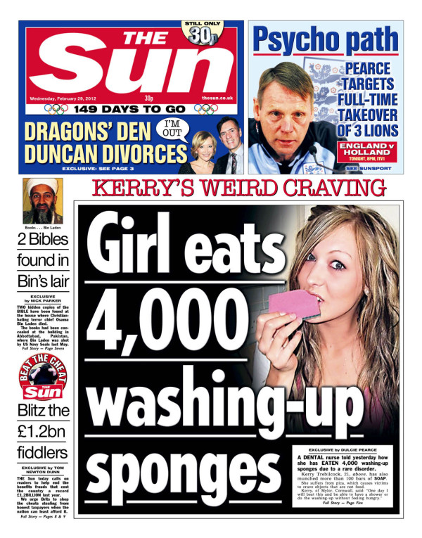
The Sun, Kerry’s weird craving, 29th February
2012
The intended audience is:
Working class adults-typically old men.
Demographic profile- D/E
What is the article about?
The Main article is a women eating a washing-up sponge.
This news isn’t important but is intended for people who don’t want
to read into important/factual news.
What is the tone of the article?
The tone of the article is fun and unimportant.
Describe the image used:
The image is a women eating a sponge which is exactly what
the title of the tabloid. It's funny and weird but grabs all types of viewers attentions.
Newspaper-notes
Soft news: Hard news:
Celebrity gossip Politics
Sports War
Entertainment news Science
Fashion news Business/Economy
Art and Culture Industries and Technology
Human interests Health
Education
Typography- Dramatic headlines in large uppercase font called 'Black tops'
The 4 Genres
Broadsheet (quality tabloids)- The Guardian, The Times, The Financial Times
Tabloids-The Sun, The Daily Mirror
Mid market tabloid-The Daily mail, Daily express
Local Newspaper- South London Press
Thursday, 14 November 2019
Convention in news
The metro:
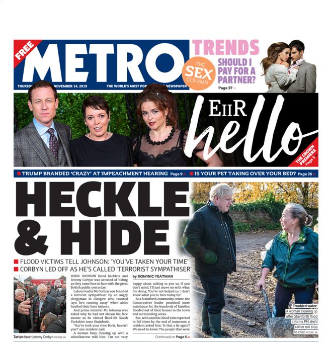
mid market tabloid paper
The metro is a formal mid market tabloid who targets the middle market audience. They give a mix of hard and soft news which includes news of information and entertainment.
They use a traditional serif masthead and often capitalise their banner headlines.
The metro is usually more opinionated than a normal quality press and the front pages are dominated by headlines and images.
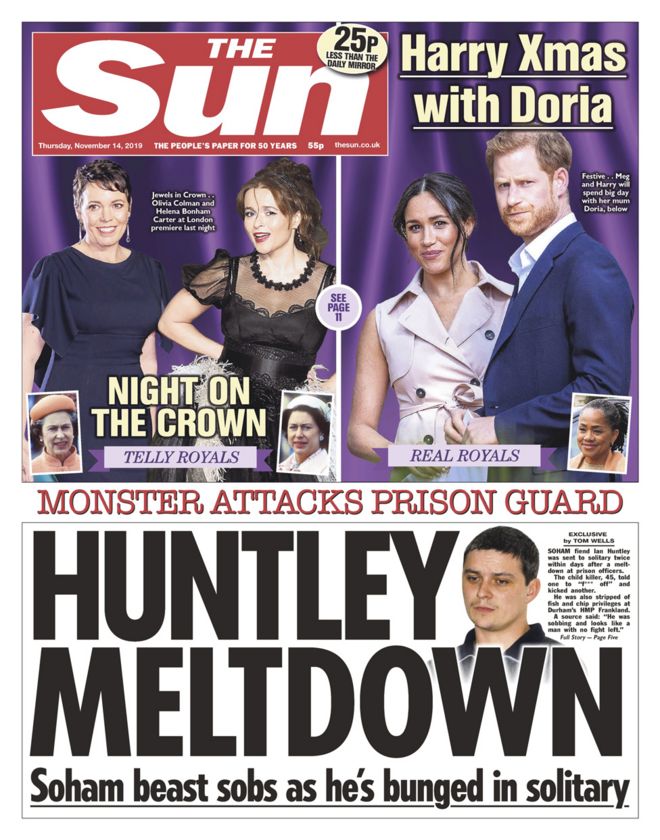
The Sun:
Red top tabloid paper:
A typical tabloid paper such has The Sun usually has a red top. So for example The Sun has a red background. They are normally informal and they only speak about soft news.
Their headlines (often a banner) are in bold, capitalised in sans-sarif fonts and the Sun's title ins bold masthead in sans-sarif fonts which is white on red.
They target the downmarket audience and offer (soft) news as a form of entertainment. E.G. Celebrity gossip, human interest stories.
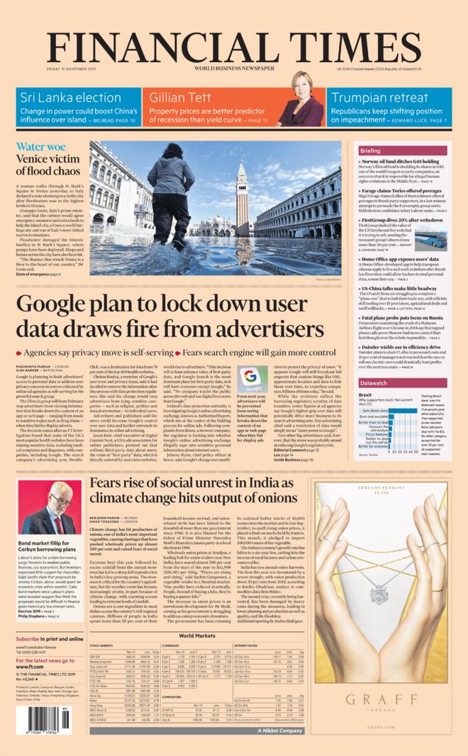
The Financial times:
Broadsheet:
The Financial Times are a broadsheet news paper. This means they use formal language and only speak about hard news such as politics, finance, international news. They typical use traditional mastheads in serif fonts, often black and white. Their headlines in serif font are capitalised as in a sentence. The front pages are always dominated copy

mid market tabloid paper
The metro is a formal mid market tabloid who targets the middle market audience. They give a mix of hard and soft news which includes news of information and entertainment.
They use a traditional serif masthead and often capitalise their banner headlines.
The metro is usually more opinionated than a normal quality press and the front pages are dominated by headlines and images.
The Sun:

Red top tabloid paper:
A typical tabloid paper such has The Sun usually has a red top. So for example The Sun has a red background. They are normally informal and they only speak about soft news.
Their headlines (often a banner) are in bold, capitalised in sans-sarif fonts and the Sun's title ins bold masthead in sans-sarif fonts which is white on red.
They target the downmarket audience and offer (soft) news as a form of entertainment. E.G. Celebrity gossip, human interest stories.
The Financial times:

Broadsheet:
The Financial Times are a broadsheet news paper. This means they use formal language and only speak about hard news such as politics, finance, international news. They typical use traditional mastheads in serif fonts, often black and white. Their headlines in serif font are capitalised as in a sentence. The front pages are always dominated copy
Thursday, 7 November 2019
Wednesday, 16 October 2019
C-L-I-F-T
C-L-I-F-T
Helps us analyse advertisements (specifically posters)
Colour-What colour is the background/text or the props their wearing
Layout-How is the poster laid out? Portrait or landscape? Where are the actors positioned?
Images-What images are being portrayed in the poster? Why choose those specific images?
Font style-Why's the font different in one text than another? Is the font original to the product?
Text-What words are mentioned in the text? Is it original?
Tuesday, 15 October 2019
Theory
Stuart Hall
A cultural theorist
He developed a theory called- "Hall's Theory"
His theory was audiences can have a different reaction towards a media text.
POLYSEMIA
Preferred reading - How the creator wants the reader to view media text
Opposition reading-- where the intended meaning is totally opposed by the reader
The other theory
Another theory was- "Reception Theory"
The idea that communication is a process, involving encoding by producers and decoding by the audience.
Idea that there's Three Hypothetical positions.
The dominant-hegemonic position: The encoder intended meaning is fully understood.
The negotiated position: The legitimacy of the encoders message is acknowledged in general terms, although the message is adapted or negotiated to better fit the decoders experience.
The op-positional position: The encoders message is understood but the decoder disagrees with it.
Albert Bandura
He developed a theory called- The theory of media affects
The idea that audiences acquire attitudes/ emotional responses and new style of conduct through modelling.
The idea that media representation of transgression behaviour, such as violence.
Hypodermic needle theory: Media effects theory relating to Marilyn Manson and natural born killers.
George Gerbner
He developed a theory called- Cultivation theory
The idea that exposure to repeated patterns over long periods of time can shape and influence the way in which people perceive the world around them.
Steve Neale's
His theory was Genre was made up off repetition.
An example of this is horror movies where us, the audience expect jump-scares and dark rainy backgrounds.
This is why movies are notable for the thing they've done differently to help them stand out from the crowd.
Monday, 14 October 2019
representation
Click on this link to have a look at my representation
https://drive.google.com/file/d/1tEa2n-8WxUbZCEOaIo71xGI-AGbsYZXg/view?usp=sharing
https://drive.google.com/file/d/1tEa2n-8WxUbZCEOaIo71xGI-AGbsYZXg/view?usp=sharing
Friday, 11 October 2019
Thursday, 3 October 2019
Boyz In Da Hood
The opening starts with off screen dialogue that leads to a shot out. This is done instantly to highlight how dangerous of a place the kids are growing up in is. It also shocks the audience straight away as it presents how bad things are in america. The camera then immediately slows zooms into a stop sign. This is to show that something needs to stop or change or whatever is happening in America isn’t good enough (the silence also helps the audience think about whats just happened off screen). The camera cuts to a long one shot. The setting is really ruff and the boys costume seem to be working class tier. 3 more characters walking to the camera shot and, the camera follows them to their destination. The setting becomes even worse when the camera showcases dogs eating desperately trying to find food in bin bags like foxes. The language coming out of the actors is distressing for audiences as no children (who we assume to be innocent) should be speaking about crimes and violence with such calmness. It makes the audience assume that this kind of violence seems normal in their lives.
The actors split into two angles. One child in a medium one shot and three kids in a medium long three shot. This separates the actors personalities. The three children who seem to be smartly dressed and reasonably well spoken. On the other angle theirs a boy who is casually clothed and seems to be heading towards this violent life.
The camera pans to the left and then there's a cut to a poster of Reagan Bush;84. The poster is in a close up and you can see its been torn and shot. There is a symbol/ message the director is trying to send to the audience which is that the working is class clearly do not like him. The camera cuts to a medium long 4 shot. The looks on the actors faces is nerving for the audience as kids or even adults should be terrified at what they are looking at. This clearly shows the violence these children have been exposed to, which is not good for anyone. A long two shot is shown and one of the boys then puts his middle finger up at the poster further proofing my point that the working class people hate him. A over the shoulder, close up two shot is shown as two of the actors are having a conversation. The attitude coming from the boy in this clip is extremely aggressive and rude. Indicating to the audience the type of langue the boy is being taught at home or in his neighbourhood.
Three counter-types
Typically people that go passed the age of 50 tend to give up on their body whereas this image is a counter-type as the old couple still putting in the work.
This is a counter-type as the stereotype of a Jewish man is a white man with a bushy beard and glasses. This man on the other hand is black which goes against the stereo-type.
This is a counter-type as the stereotype of a Jewish man is a white man with a bushy beard and glasses. This man on the other hand is black which goes against the stereo-type.
This is a counter-type for overweight people because people imagine them to be eating loads of food but this person is doing something about it by running and working it off.
Friday, 27 September 2019
Media language-notes-understanding the use of sound and editing
What sound or edit has been included
|
Why has it been included
|
Screen time- The girl is on screen at pivotal moments in the plot.
When the mood changes, when the action begins/ends.
|
This allows the audience to identify her as the guide in the film.
It also allows us to emphasise with her as an innocent victim.
|
Change in tempo music starts slow, then speeds up until it stops and
there is complete silence.
|
Mood of diagetic music is parallel to the plot.
Music slowly dies out until silence- this is done to enhance the
screen time.
|
Speed of the transitions and the type of transitions changes.
|
Speed enhances the chock for the audience and, also creates complete confusion
so that when the bodies fall apart and drop, the horror is far greater.
|
Sound effects and volume when people are being killed
|
“Slash sound” “squelching” enhances the volume.
Realistic music echoes- changes the pace from being calm to the
action starts. The echoing is foreshadowing the ghosts plus it sounds like
being underwater.
|
Thursday, 26 September 2019
editing practise
This was me practising to edit videos. I gathered multiple clips and combined all of them into one video. I learned how to fade clips and how to transition from a birds eye view to a POV. Although the editing is not great, I now understand the basics of editing and hopefully in the future be able to completely master it.
Tuesday, 24 September 2019
angle practice footage
This is a task that I had to do on Adobe Premiere.
This task was to help me learn all the camera angles used in movies/commercials.
I know the editing isn't the best but i was able to do some fades and the transitioning fits in with the music.
Monday, 23 September 2019
Mise En Scene
Mise En Scene: French term meaning what is put into scene or frame.
It communicates essential information to the audience such as the time and place.
Mise en scene includes everything you see in-front of the camera.
It communicates essential information to the audience such as the time and place.
Mise en scene includes everything you see in-front of the camera.
Costume - Tells us the time period/society/culture.
Lighting - Highlights characters/objects, can portray the mood of the scene.
Actors - Shows emotion towards the / relationship towards other characters.
Makeup - Acts as an indicator to the characters personality/status/job
Props - They can highlight the genre or reveal a key part of the story line.
Setting - Can manipulate an audience by building expectations and taking a different turn.
Lighting:
Low key/ uses only dark lights, produces sharp contrast of light and dark as well as shadows and silhouettes.
High key/ more filler lights are used, lighting is natural and realistic to our eyes, produces bright sets and a sunny day. Typically uplifts the mood.
Natural/ uses natural lighting from the surroundings.
Positioning within a frame:
Directors will position actors at key points to help the audience understand how important a character is to the scene/movie/episode and/or how powerful they are at this very moment.
An example of this is if the actor is on the side of screen is typically not as important or is not as powerful as the other actor (in the same shot) who is in the centre of the screen.
Another example is in a poster where two characters are sitting next to each other but there's a bit of distance between each other. We would then assume they could be a couple that have fallen out with each other. This would then indicate to the audience that this film will be a romantic comedy.
Another example is in a poster where two characters are sitting next to each other but there's a bit of distance between each other. We would then assume they could be a couple that have fallen out with each other. This would then indicate to the audience that this film will be a romantic comedy.
Thursday, 12 September 2019
summer holiday work
Deutschland 83’
At the start we see real footage from the Cold War in 1983. Showing the audience, the following events are based around true events. The clips are slightly blurry and haven’t been edited to be clearer, in my opinion this highlights the age and authenticity of the videos. In order to highlight the authenticity and era of this drama.
In the trailer, the director shows many close ups, for example the close up of the three men walking in a row. In this frame you can only see the feet and legs of the men, this has been done to create questions in the minds of the audience. The curiosity persuades the audience to watch the series as intend by the director.
Throughout the video we see a contrast between the east and west via the costume. In one frame the lead actor wears a German soldier’s uniform whilst on the other side he wears an 80’s red puma t-shirt. The formal dull uniform placed against the casual red shirt creates an obvious contrast in order to highlight the character’s skill at changing drastically when undercover.
Between the contrasting shots, a line has been edited to join the two scenes together, this line is most likely a representation of the Berlin Wall.
An 80’s disco track is playing in the background reflecting the era the series is set in. When the tempo of the song and voice of the narration increases in pace the clips shown have been edited to do the same. This is in order to represent the rapid action in the short but frequent frames from Deutschland 83’.
There is a lot of harsh white lighting featured in this trailer. Possibly to indicate the harsh reality at the time, as the cold war in 1983 was at its peak. In other frames, eg. Where the lead actor is swaying whilst hugging a young woman the lighting has a blue tinge. Blue could represent peace and tranquillity amongst the chaotic action shown in the rest of the trailer. Both the blue and the white are cool toned colours, again representing the Cold War.
semiotics
Media Language
Connotation of this poster-
A women standing on top of a mountain
There's a sunset
The title has a badge of fire behind it
There's writing on top
Denotation of the poster-
The badge catches on fire just like the subtitle wording
The writing on top say "so I make myself stand" which is what Katness is doing
The cloud behind you is in a shape of a mocking bird
She is holding a bow and arrow which is her specialist weapon in the games
Semiotics-
The study of signs.
Also means anything which stands for something else.
Denotation-
What we see when we look at an image
Connotation-
What we understand from looking at an image


Connotation of this poster-
A women standing on top of a mountain
There's a sunset
The title has a badge of fire behind it
There's writing on top
Denotation of the poster-
The badge catches on fire just like the subtitle wording
The writing on top say "so I make myself stand" which is what Katness is doing
The cloud behind you is in a shape of a mocking bird
She is holding a bow and arrow which is her specialist weapon in the games
Wednesday, 11 September 2019
Genre
Sci-fi


The purpose of using science equipment such as a microscope, plasma ball and a tube with a liquid inside is because, I believe sci-fi films are really scientific and a lot of sci-fi fans wold appreciate the little details such as labeling the liquid "cure" and a piece of paper saying "virus" under the microscope. I decided to take the pictures with a bright background. made sure there was a girl in the pictures as I want to attract . If I could take pictures again i would make the person in the picture improve her facial expression.
War
The other genre given to me was war so I decided in the first picture to have the actress to shoot water out of the bottle, as if she was shooting a gun as well as to take cover like what soldiers would do in an actual war. The second photo I decided to have her laying down on the grass to re-imagine a war scene. The final image I made the actress take cover and hide her face because I wanted to represent the fear the soldiers has when participating in a war.
Monday, 9 September 2019
DISTINCT

A dark gloomy setting which was set in the evening. Two different places are presented, a shed and a restricted area.The theme appears to be love with a women worrying about something and good vs evil. We can tell this by the glowing mysterious man on the right-hand side. Guilt is presented with the boy holding a camera having a distraught face. There are many significant props. The baseball bat, bikes, walky-talky and a gown. The main characters are presented in the poster. All but one of the characters are white and from the looks of the people they were all born in America. 3 Girls 7 boys. There are letters going in alphabet order on the left hand side. A moon glistening in the top right.
Friday, 6 September 2019
MOOD Board
LIAR
I like this video because its about football. The hosts in this show are Arsenal fans just like me and the podcast is very opinionated and they cover the whole footballing world. There's only one camera and the hosts behave like the audience are involved in the conversation. The thumbnail has bullet holes in the glass which is foreshadowing the "shots being fired" in the video.
The host on the left started this channel with one of his friends. Their aim was to give the fans an opinion of football and not just pundits who have to be careful to what they say. Aftv the company who publishes the podcasts every week on Youtube also have their own football team who take part in the Blud Bruvvas season.
The targeted age group tends to be 14-26 and follow football almost everyday. Their audience are football fans from and support clubs all over the world.
The podcast is not targeted to a certain ethnicity as the two hosts are English and Jamaican and the camera man is also from Jamaica. They do however have a all male cast for this podcast as their targeted audience are mainly men.
Subscribe to:
Comments (Atom)


